
We wish we had considered accessibility at the beginning of development, it would have made the complete process a lot easier. But we can only imagine most of us are asking the same question. “How do we go about improving website accessibility”
To help combat website inaccessibility W3C has created the Web Content Accessibility Guidelines (WCAG). These guidelines will help us make our website more accessible. WCAG 2.2 comes in 3 levels A / AA / AAA. Having a certified 2.2 AAA means nearly everyone will be able to navigate our website.
Table of Contents
WCAG is law
Many governments use WCAG (including the UK) to define legal requirements for website accessibility. In the UK, public sector websites and apps should meet WCAG 2.1 Level AA, though there is no law for the private sector. We at I.T. Recipes wanted to achieve the same.
In the USA it is a legal requirement to have an accessible website, related US lawsuits have more than tripled from 814 in 2017 to 2,523 in 2020.
If you want to see if your country has accessibility laws, W3 have a great list on their site
Why improving website accessibility is important?
Beyond the obvious reasons, making our company and website more inclusive. Having an accessible website opens us up to a new market, new clients and new possibilities. One in five people in the UK have a lifelong disability, impairment or health condition. Plus, many with temporary ones. That is a huge number of possibilities.
Accessibility isn’t just for people with health conditions or impairments. It’s for everyone, a ramp outside a shop for example provides access to wheelchairs, those who struggle with steps, kids who find it fun to run up and down and someone carrying a heavy load.
This is the same with our website. Elderly people may find our site easier to read, kids might navigate our site easier, especially those helping someone. Some techniques we will go over will also make our site function better on a mobile device for non-impaired users.
Accessibility should always be on our minds. Every post, every page and every change should go through a process to make sure our site stays WCAG compliant.
SEO Accessibility Checks
Even Google makes suggestions on accessibility with its tool Measure. This could show that Google will prioritise sites with more accessibility options. Though we can’t see if this is an official Google line it makes sense to stay ahead of the SEO game.
How do accessible users use our site?
Before you go too much further into fixing issues with our website, we need to understand how our website looks. Try the below accessible software and see / hear how your website is viewed by accessible users for yourself.
Screen reader
A screen reader does what it says on the tin, it reads any text on a page, with images they will say ‘Image’ then read the image alt text.
| Operating System | Name | Screen Reader Type | How To Enable |
| Android | TalkBack | Built In | Open Android settings Search TalkBack or select Accessibility > TalkBack from the menu Toggle switch to turn on |
| Microsoft Windows 10 | Microsoft Narrator | Built In | Open Settings > Ease of Access > Narrator, and then turn on the toggle under Use Narrator |
| Apple Mac, iOS, tvOS | VoiceOver | Built In | Desktop Press Command-F5 Mobile Ask Siri to ‘Turn on VoiceOver’ OR Open Settings > Accessibility > VoiceOver, then turn on or off |
| Amazon FireOS 5 + | VoiceView | Built In | Press and hold the power button until you hear an alert sound. Hold two fingers slightly apart on the screen for five seconds to enable VoiceView. |
| ChromeOS | ChromeVox | Built In | Desktop Press Ctrl + Alt + z. Tablets Press and hold the Volume down + Volume up buttons for 5 seconds. You’ll hear a sound to indicate that it’s working. Keep holding the buttons, until ChromeVox starts speaking. |
| Microsoft Windows | NVA | Open Source, Third Party | https://www.nvaccess.org/ |
We suggest you try this yourself. When we used a mobile phone screen reader, it surprised us how much it changed the way we used our phone. It was really hard to get used to it, click to read, double click on a button to activate, 3 finger click on a website link to activate. I don’t think any of us have double clicked on our phone ever.
Magnifiers
Using software users can enlarge our website, making it easier to read. Most operating systems and browsers have one built in. You might be surprised what you find when yur website is put under the microscope
| Operating System | How To Enable |
| Android | Settings > Accessibility > Magnification |
| Microsoft Windows | Windows logo key & Plus sign (+) |
| Apple Mac | Apple menu > System Preferences, click Accessibility, then click Zoom |
| Amazon Fire | Triple-tap the screen with a finger. |
| ChromeOS | Ctrl & Search & m |
| Apple iOS | Settings > Accessibility > Zoom |
Colour Blindness
Users with visual impairments will view our site in a different colour. This could be because.
- The user has a visual impairment that means they can not see a particular colour so our site will look different naturally for them (Colour blind).
- They use a high contrast theme, or invert colour setting on their device which changes colours slightly to help them read (Similar to Dark theme on mobile phones).
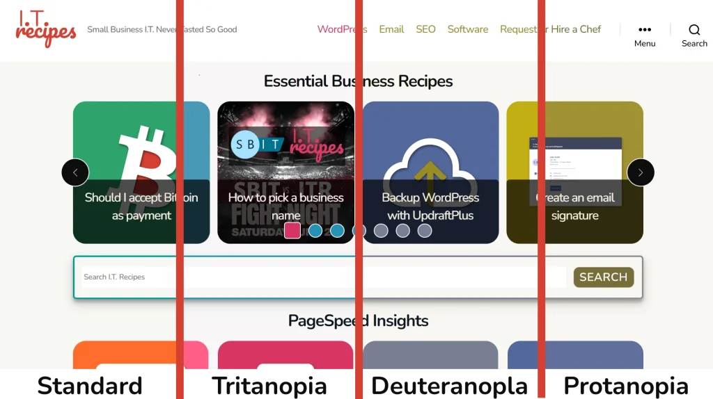
Colour blindness comes in various varieties and affects 300 million people.
- Blurred vision–lack of sharpness
- Protanopia (most common)–can’t see any red light
- Deuteranopia–can’t see any green light
- Tritanopia–can’t see any blue light
- Achromatopsia (totally colour blind)–only can see the shades of grey
Luckily for us Firefox, Chrome, Adobe and GIMP have some help baked straight in. If you don’t use Firefox or Chrome, don’t worry, we can use a tool by Toptal to test. These tools will help us see what users see so we can better understand how our site looks.
| Software | How to access |
| Chrome | Press the 3 line menu More tools Select Developer Tools In the top row of Web Developer Tools, press the 3 dots in the top right corner Select More tools > Rendering From the new Developer tools window scroll down to find Emulate vision deficiencies |
| GIMP | View > Display Filters Select Color Deficient Vision from Available Filters Press ->Select Color Deficient Vision from Active Filters Select a colour filter |
| Firefox | Press the 3 line menu More tools Select Web Developer Tools In the top row of Web Developer Tools, select Accessibility From the 2nd row select Simulate and choose a filter |
| Toptal | Navigate to Toptals Colorblind Web Page Filter Enter our websites URL Select a colour filter Press FETCH AND FILTER |
WordPress Accessibility
If you use WordPress, then you’re already going in the right direction. WordPress has been built with accessibility in mind, but it will depend on your WordPress version, themes and plugins.
We currently are using the default WordPress theme Twenty-Twenty, this theme has accessibility baked in. Most popular themes also have features to help. But we also use a plugin called PostX which as of early 2022 is lacking some features we need. For example, WCAG states we should not have 2 of the same links next to each other but because of the way PostX works, we have a link for the image and a link for the text over the image. This will mean a screen reader will read the same thing twice, we can all agree that sounds annoying.
It is worth noting that some of our issues are caused by plugins which we have no control over. It may be necessary to change to a different plugin. This will depend on what level of WCAG you are aiming for and on the error / alert.
Accessible plugins – these plugins can give the user the ability to increase font sizes directly instead of zooming. These plugins also have many other features to help with some topics brought up in this article.
How to improve our site for accessibility
Now we know how our website is viewed, we can look at how we can improve it.
There are two types of tests, manual and automated. Automated will only go so far, a review by Mehmet Duran, a developer in the accessibility team at the UK Government’s Digital Service group in 2018 showed software will only find 40% of accessibility issues. We will use WAVE, which scored 39%, in this test. Manual testing will help us find the remaining 60%, this won’t be a quick and simple task. Website accessibility is not just for Christmas, it’s for life.
Manual testing
70% of WCAG testing involves manual human interaction, no automated system can do this for you. Software can make educated guesses, but it’s down to us as business owners to either hire someone or perform these tests ourselves.
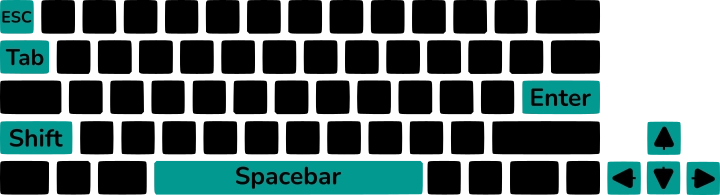
Keyboard navigation
Our website should be fully navigable via our keyboard. Nothing should be reachable by a mouse only. Use the below tips to check your own website.
- Tab order – Open your website, wait for it to load and press tab. Is the correct item highlighted? With each press of the Tab button we should navigate down our website selecting each link.
- Don’t forget Shift + Tab to navigate back
- Menus – can a user select a menu item using up, down, left or right arrows. Is anything skipped?
- Skip links – these are links that allow an accessible user to skip straight to our main content. We don’t want to read the main menu every time we go to a new page. We found we started in the main content and needed to press Shift Tab to find our Skip link.
- Spacebar – activates check boxes and buttons
- Enter – activate links and buttons
- ESC – close popups
Ridiculous zoom
Zoom to 200% to check if content is still present, doesn’t overlap, loses functionality, no content cut-offs and is in the correct order.
Automated testing
We will use the WAVE Web Accessibility Evaluation Tool to analyse our website.
Automated tools are useful but certainly not infallible, as automated detection will only go so far. We also have found that some detect slightly different issues than others. Whatever tool we use we need to stick to one a the base line, checking our site with every tool on a regular basis is a full time job.
Load up WAVE, enter your website address then press enter or the arrow to the right of the input box.

WAVE will analyse our site and highlight any areas of concern, using the menu to the right we can see errors, alerts ⚠️, and passed tests ✅.
Redundant link – Adjacent links go to the same URL.
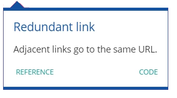
Screen readers will read links, if two links are next to each other it will read both. Hearing the same thing twice can be quite annoying. Hearing the same thing twice can be quite annoying.
On our original site we had 2 menu items, 1 for ‘Hire A Chef’ and another for ‘Request A Recipe’. Both links took you to the same form, to rectify this issue we combined this menu item into what you see today ‘Request A Recipe Or Hire A Chef’
We also have this error pop up on our home page for our recipe tiles. We created these tiles using a plugin called PostX, we sadly have little sway over how it works but we reached out to them. They stated they are working towards compliance.
Solution: Have a look at your own site, if two links are close and the same can they be combined?
Redundant link
It’s all in the title, our link is redundant or pointless. We achieved this error on posts where the feature image at the top linked to the current page. This was because our original theme featured images on our category pages where not clickable, we wanted them to be clickable to help users navigate the site. Because we set this as a global setting now all feature images include a link. We made a few tweaks to our child theme to solve this.
<Code example of child theme change>
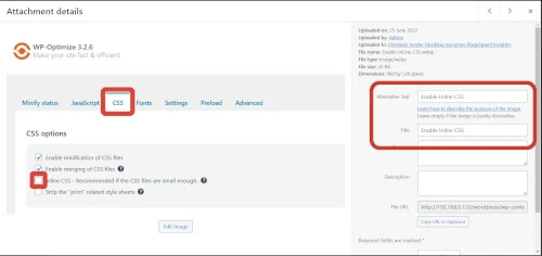
Redundant title text – Title attribute text is the same as text or alternative text.
This one is an easy fix, change your images title text so it’s not the same as your alt text by opening your WordPress Media Library and changing these.
WordPress Dashboard > Media > Library
- Image Title – This is the tooltip that appears when we hover our mouse over an image, it should be short and sweet.
- Below Image – WordPress Media Library
- Alternative Text – Used by accessible users to explain an image.
- Below Image – Where to change your title and alt text in WordPress Media Library
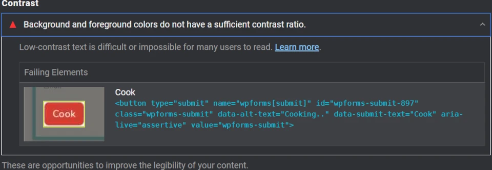
Very low contrast – Very low contrast between text and background colors.
Anyone who has a visual impairment will struggle to read certain colours of text, especially when we use a coloured background.
We can check out contrast with the WebAIM Contrast Checker built into WAVE. Click on the contrast error to see which areas you PASS or FAIL. We can tweak the colour to see what works and change our site based on this. We can also change font size and styles to provide better contrast.
WCAG defines normal text as 16px, large text is 18px bold or 24px non bold. WCAG 2.0 level AA requires a contrast ratio of 4.5:1 for normal text and 3:1 for large text.
To fix our error, we changed our colour palette completely. We went from #d53f33 to #cf3a2f for links and colour accents. To be honest, we can’t see much difference in the contrast, maybe I need new glasses.

Solution: Depending how you have setup your site, this issue can be quite a long one to solve. You may need to either:
- Change your custom CSS file, a simple find and replace should work
- Individually open each page and change aspects of it to suit the new color option
- Use WordPress > Appearance > Customise > Colors
Alternative colour contrast checker
Learn UI Design will also suggest alternative colours
Who Can Use displays what and how visual impairments certain colour combinations.
Missing alternative text – Image alternative text is not present.
Use alt text that is descriptive DON’T use alt text just for SEO purposes. If your image is complex or requires extra information use the image description box as well. Some users will set their screen reader to read both the alt text and description others won’t.

Linked image missing alternative text – An image without alternative text results in an empty link.
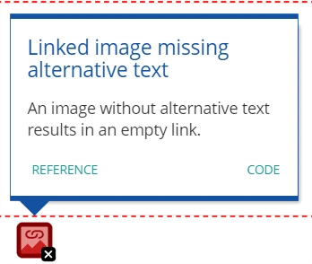
This is basically the same as Missing alternative text, follow our Alt Text Recipe to find out more.
Empty link – A link contains no text.
This one is quite difficult to solve, with modern day coding we might have a link that doesn’t technically go anywhere but might change our site’s functionality. For example, the arrows on a carousel that change the current image or tiles on view. If you’re using a plugin to achieve this, you can contact the developer, the pessimistic side of me thinks everyone will always say ‘this is something we are working on’ because no one in their right mind would say no even if it’s so far down the to-do list it might as well be.
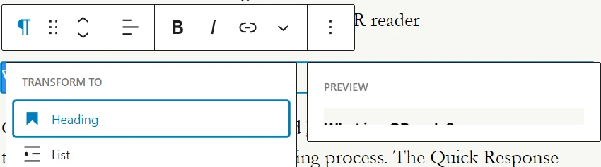
Possible heading – Text appears to be a heading but is not a heading element.
Headings provide our page with structure, they allow users of any ability to navigate throughout our page quickly to locate the content they want. They also help improve SEO.
This heading alert ⚠️ will appear if you have set the size and style of a word to that of a heading.
Solution: To fix this alert ⚠️, first we will determine if our text is a heading. If it is, then we can apply the correct WordPress heading block, if it’s not then we can ignore it. We may want bold large text half way down our page if that’s the design.
Noscript element
A noscript element or <noscript> is code that is displayed when JavaScript is disabled or not supported. Often this is a simple message like ‘Unable to display content, please enable JavaScript’.
Though all browsers support JavaScript, it is important our script is accessible. For example, if we have a Java built menu then it must be navigable using a keyboard. This alert ⚠️ is more historic than relevant, as now modern screen readers can deal with JavaScript. Though there are some users who may turn JavaScript off be that an accessible user or a security conscious user.
Looking at our Wave report our newsletter sign up form which is created using WPForms produced this noscript alert. Further research we can use Formidable Forms as an alternative as they have an excellent WCAG rating.
Suspicious link text – Link text contains extraneous text or may not make sense out of context.
Don’t use Click Here links, use descriptive links so screen reader users know what you are linking to
The easiest way to find these is to use our site’s search function. Search for “click here”, “link”, etc. Open each page and edit this link text from ‘Click here to view our recipe on email templates’ to ‘Read our create an email template recipe’
Redundant alternative text – The alternative text for an image is the same as nearby or adjacent text.
This is another simple fix, if the images are different then we need to edit their ALT text. If the images are the same, we need to consider why the image appears twice. For us it was our logo in both the header and footer. We only achieved this error on a test page that had 2 lines of text. Even on our smallest article we don’t receive this error as there is enough distance between them.
Link to PDF document
This alert is more of a prompt for you to check that we have created our PDF document with accessibility in mind.
To test our PDF, you can download a free testing tool from the PDF/UA Foundation
Audio/Video
Another alert / prompt. Check your video has both subtitles and text description.
If using YouTube, which we will assume you are, they will automatically process our video subtitles for us. We can also include a text description of speech and plot points, as YouTube descriptions are length limited we could include these via a link. These descriptions don’t need long detail.
Gordon Ramsey chops onion with knife
Is better than
Gordon Ramsey reaches for a small black knife. Holds onion with his left hand, chops both ends off then curls his fingers. Gordon then chops in straight lines.
WCAG does state that we should also include an audio description of the speech and narration of non audible plot points. This isn’t particularly possible with YouTube currently.
Skipped heading level – A heading level is skipped.
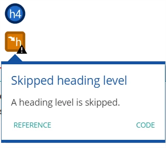
Have you ever used heading text for styling? Don’t, It ruins the flow of your page. Accessible users may find it difficult to navigate your page and it’s bad for SEO. To rectify this we simply need to change our text to normal and style it using CSS or WordPress’s built in text styling.
This could also be just a simple mistake of selecting the incorrect heading type while writing your post. Having the incorrect heading types on your page would be like reading a book Chapter 1 then Chapter 4, then Chapter 2 and 3. The book makes sense but it doesn’t flow.
Conclusion
Accessibility isn’t just for Christmas, it’s an everyday process. We should check every new post and page to ensure we have met accessibility standards.
Sadly, because of the way they designed WordPress it can be a struggle to meet these standards, plugins are not in our control and can create problems. We had 2 plugins cause issues PostX and WPForms. PostX we can’t change but are looking for a suitable replacement while Formidable Forms has replaced WPForms as this plugin considers accessibility.
Nothing is perfect, we have made every change we can but still get several errors and alerts from WAVE
7 Contrast Errors – These all seem to be an error on the checkers side as it thinks we are using grey text on a pink background.
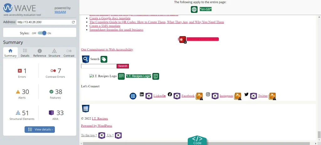
1 X Empty link – Caused by the PostX plugin
30 X Redundant link – Again caused by PostX
If you will put in the time, and we suggest you should, we can create a site that’s accessible to everyone. You don’t need to test every page and every day, test a sample of 4 to 8 pages a month and see what issues you find.
No one will hate you for trying.
Alternative online accessibility checkers
https://www.deque.com/axe/ – Google Chrome extension
https://www.alumnionlineservices.com/accessibility/scanner/ – Sign up required, only tests for WCAG 2.0
A quick thank you to https://accessibleicon.org/ for creating the icon used in our feature image
TweetStruggling with the above recipe? Hire a chef to do it for you