

Another day and another PageSpeed insights opportunity for us to tackle. ‘Image elements do not have explicit width and height’ is one of the more simple issues we will have to tackle. You might see these issues crop up when we run our site through Google PageSpeed or web.dev measure.
Table of Contents
What is Image elements do not have explicit width and height
‘Image elements do not have explicit width and height’ is like having ‘4 pack of beer’ on our shopping list. But we see a great deal on a 22 pack of beer. To accommodate this unexpected larger purchase we need to rearrange our shopping trolley. Our website is similar, our HTML code is like a shopping list, we tell the user’s browser there is an image then at the last moment we then say oh that image is 5 times bigger than you were expecting. Our user’s browser then has to rearrange everything. Causing the users screen to ‘Jump’ and shift, this jumping is called CLS (Cumulative Layout Shift)

If you’re going through PageSpeed Insights have a look at our recipes to help you along the way
- Defer offscreen images
- Ensure text remains visible during web font load
- Serve images in next-gen formats
Short Answer
Add width and height to your HTML.
<img src="eggpoached.webp" width="340" height="160" alt="Poached Egg" />This will tell the user’s browser how much space to reserve for our image and put an end to any layout shifts.
OKish Answer – Aspect Ratio
Instead of defining our images height and width we can define our images aspect ratio. This will give our users browser a better idea on how much space to save.
.img {

aspect-ratio: 16 / 9;

}
The pitfalls of this solution is that it’s only supported by modern browsers, if our user is using an old browser then it’s ignored and we are back to the drawing board of default fonts.
You will also need to add in width or height for the browser to know exactly what area to reserve.
Best Solution for a Response Website
When someone or something says “you’re missing the height and width” then add the height and width. Yes, there are other solutions like aspect ratio but that’s not what we were told is missing.
<img src="eggpoached.webp" width="640" height="960" alt="Poached Egg" />
To make sure our website is still trim and fast we could also add srcset sizes to our code. This allows the browser to choose which image to download based on the user’s screen size. EG a mobile user doesn’t want an image that’s 3 times the size of their screen, they want a small image.
<img

srcset="eggpoached-480px.webp 480px, eggpoached-800px.webp 800px"

sizes="(max-width: 600px) 480px, 800px"

src="eggpoached-800w.webp"

alt="Poached Egg"

/>

<img

srcset=image-location image-size

sizes=screen-size image-size, image-size

src=image-location-for-older-browsers

alt=Brief description

/>
You will notice we have left in src this is because older browsers don’t support srcset and will default to src
Best Solution For WordPress
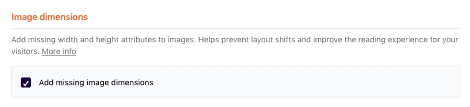
If you’re using WordPress install WPRocket from your plugins page. WPRocket can add width and height for our images automatically.
Open WP Rocket > Media > Add Missing Image Dimensions.
If you don’t use WP Rocket, then WordPress already has us covered. When we upload a new image, it will automatically create several sizes of it. WordPress will then use srcset (described above) to display the correct image based on our users screen.
Incorrect Answer – Using %
Something that we see all too often is to use %.
width="100%" height=autoThis solution will ‘work’ and PageSpeed Insights will stop displaying “image elements do not have explicit width and height” as an opportunity. But our user’s browser still doesn’t truly know the image size, it knows our page is 960 pixels wide and our image will display across all 960 but it doesn’t know it’s height so anything under the image will shift and jump to accommodate it once it’s downloaded.
Tweet
Struggling with the above recipe? Hire a chef to do it for you